


One of the most influential elements of a business’s brand when creating graphics, that range from a logo to a brochure, is colour. Yet whilst mulling over their options many businesses can overlook the fascinating influence that colour psychology may have on their choice. The psychological effects of colour are all around us – from red being used within road signs as warnings, to yellow being the colour used within Easter cards and right onto the greens that appear to point us to safety – including First Aid kits and the flashing green man to instruct us to cross the road.
There’s no doubt that colour certainly does influence our instant feelings and reactions, and in this guide we dive into the topic a bit deeper to discover the ways in which colour can be used in business.
The science behind colour
Whilst the link between colour and psychology has been written about often, the solid scientific research to back up widespread understanding is relatively sparse. This is most likely down to fact that reaction to colour is subjective, and because of this any scientific research would have a tough challenge to provide solid methods to dig through what may be unquantifiable opinion.
It’s important to note however that whilst our perception of colour is indeed based on our own opinions and experiences, there are broad stokes that we can make towards understanding how we can harness colour for business. This is backed up by one particularly influential piece of research called the Impact of Color in marketing; the result of this study showed that 90% of people made instantaneous judgements on a product based on only the colour. What’s more there are also further studies that have at least attempted to pin down colours as they relate to emotions.
One such piece of research featured in the College Students Journal where the findings reported that the colour green was associated with nature, and that the participants linked it with feelings of calmness and relaxation; similarly, blue was linked to water and was associated with comfort and peace; whilst finally red was linked to love, yet surprisingly was reported to be also associated to dominance. These findings were also reflected by Clarke and Cotsall’s study, where participants associated red with anger, energy and passion, whilst orange and yellow were linked to far happier descriptions. Also within this study was green and blue, which were described as peaceful, relaxing, clean and calming – another reflection of the former study’s results.
Colour in business
The use of colour within certain realms of business and industries may be no better demonstrated than by taking a look at some of the world’s biggest companies, and how they can be grouped with other brands. The illustration below, from Help Scout, then makes for an enlightening image.

Putting it all into practice
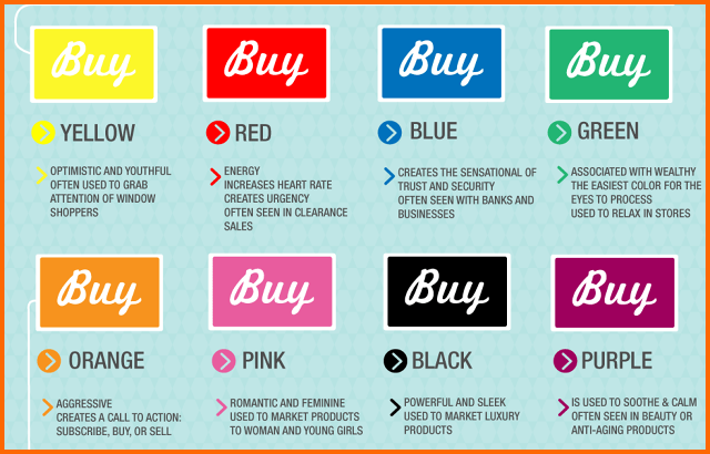
Whilst we can look at the logos of brands and make some assumptions on why they’ve used colours the way they have, it’s often within packaging and other design elements (such as websites) that we get to see colour psychology in action. This illustration from BottomLineInc provides a straight forward example of the use of colour as it relates to food retail.

Building on these examples, and looking generally at the use of colour in packaging, as well as within wider business applications, is this illustration from Pit box.
Five quick tips for harnessing colour psychology
The study of colour psychology is an incredibly advanced field, and one that you could spend weeks upon weeks studying and still not have the complete picture when it comes to putting the science into action. The following five tips eradicate the need for this time-consuming task and gets straight to the point when it comes to making the most of colour psychology.
1. Call the customer to action with orange
Orange has been linked with haste-like actions as it, for reasons unknown, creates a tendency for people to act on impulse.
2. Use bright, primary colours for other calls to action, and use it within website headlines
Opting for dull colours, such as black, dark gray, brown, or purple, are useless for both converting a customer, as well as holding onto their attention; for boosted sales and an audience who is more engaged opt for bright primary and secondary colours such as red, green, orange, yellow.
3. Targeting men? Avoid purple, orange, and brown and opt for blue, green, and black
One ground breaking study by Patel, as reported on by Kissmetrics, found that there were clear splits in preference for certain colours between men and women. Of the colours listed above, it was blue that led the way in terms of number one preference for men.
4. Targeting women? Avoid Gray, orange, and brown and push for blue, purple, and green
The same research also found that females preferred and disliked colours in a contrasting manner, with studies that went beyond Patel’s to also reveal a female aversion for earthy colours. These are all seen in action on large brand websites that are targeting women – whether these marketers and designers are merely following a trend, or are basing their choices on a deep understanding of colour psychology, we may never know.
5. Don’t neglect the use of white
White may (or may not) be officially classified as a colour, either way it does play an important role in design, with some of the slickest brands in the world always making the most of the power that comes with it. Take Google and Apple as leading examples.
Whilst colour psychology makes for a fascinating realm of marketing, it’s no substitute for knowing your audience, and for good-old fashioned market research. To this end, the key to making the most of the principals of this field is to customise it to your industry, your brand and your audience – and continually trial various designs through unbiased testing to gain feedback from consumers.


